Lydia Phung
5 weeks from research to solution
1 sprint for development
Have you ever purchased an item online that you didn't end up loving, but found out too late there's a shipping fee? Most likely, the return policy is somewhere on their website but it's either hidden or embedded in other long policies.
It's not too far from how our clinicians feel about committing to a shift, later needing to call out, and only to find out it goes on their record. This study outlines how I solved for this new user awareness gap.

Our facility partners count on our clinicians to show up and provide quality care to their patients, so it’s a frustrating experience when their help doesn’t attend their shift. In general, newer clinicians often don’t understand what connectRN’s policies are around attendance. This can lead them into trouble when it comes to frequent call outs, no call no shows (NCNS), and facing termination.
With the push and need for clinician quality, it became clear that there’s an opportunity to better educate these new users on exactly what our standards are and how to be more successful at connectRN.
In the discovery phase, I partnered with my PM to facilitate a workshop around post onboarding pain points.
With participants being client facing teams, they brought up and voted to focus on the issue of our new nurses having higher callout rates than seasoned clinicians.
.png)
With multiple brainstorming sessions with the design team, I first chose to surface the educational moment upon the clinician's first apply as this is a clear signal to us they wanted to commit to connectRN.
I opted for the modal and bottom sheet experience as many of the app's key user flows, including applying, already involved bottom sheets and modals.


Tested Design
I decided to go with something more simple and clean for an initial run, choosing to bold important information.

Goals
Test Outline
Participants
Results
Next steps
Although our assumptions were proven correct, the feedback on the initial designs showed that most clinicians blew past the "first time" moment.
We want this moment, before they apply/instant accept, to be impactful and thoroughly understood. The first user experience should always be a special/pointed moment and this is no exception in our product. The second iteration was done to make clinicians stop to notice more by elongating the flow in a way to break up the visual and copy to be digestible.
Stakeholder Narration Video
At this point, I wanted to a step back and start thinking about other major decision points where users would like to be informed before taking an action, especially if it's their first time. These flows are outlined in the stakeholder video I sent to gather internal feedback and alignment.
Stakeholder Feedback
"Great job on this, I like the overall thought behind it, clearly having a pop up that explains the expectations in a concise way, that they have to interact with it in order to get back to navigating around the app. The color coding is a nice touch too. Definitely feels like a huge step forward in helping folks to understand the expectations. I also really like the ability to fill out a short form to request off, giving folks a way to remove shifts in a responsible way is super helpful."
- Head of Onboarding
"This looks great! I love the focus on providing resources to clinicians if they are struggling with burnout."
- Community Experience Manager
"This is awesome, I hope this idea get's funded because we need this."
- Director of Product Marketing
"I also love the tone direction and the color coding of the different "options." I think that kind of messaging is super smart and engages the user without an accusatory tone."
- Digital Community Manager
Once we felt confident that our stakeholders were on board, the below artifacts were presented to leadership for funding. With the potential to impact $772k/quarter, and the cost to build was $30k, this project was unanimously given a green light.
.png)
I had prepared a second user test ready to fire upon approval. This time it was focused on usability and whether seeing these screens would make users reconsider calling out. The results were positive.
Between the first and second
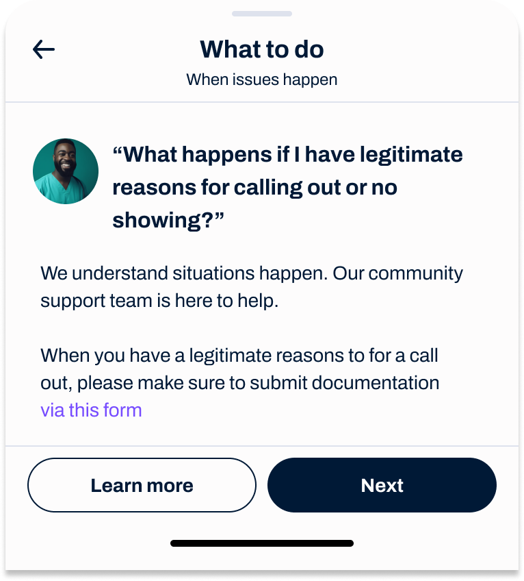
We mainly want clinicians call outs only for emergency reasons and unavoidable situations. Even so, I still saw an opportunity for a happy path and if they must call out, that we can support clinicians throughout their call out journey.
Since the first the test, I added a few more educational flows such as first time calling out, and I worked with product marketing and life cycle team for copy suggestions to nail down the messaging and tone as the final step before handing off.
Results & Synthesis


User Flows 1 & 2: First time applying and first time instant accepting

User Flows 3: First time being accepting

User Flows 4: First time calling out

User Flows 5: Checking in for frequent call outs

Although we outlined many benefits to pursuing this idea, we acknowledged there were a few challenges we may face:
